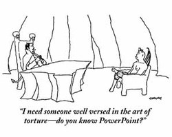
A wise cartoon by Alex Gregory
There are three types of Powerpoint presentations: those that work, those that don’t, and those that shouldn’t have used Powerpoint in the first place.
Years ago, a client of Young Isaac’s completely outlawed Powerpoint presentations. Management had found that everyone was sitting in eight Powerpoint presentations each day, managers were emailing .ppt and .pps left and right, and the entire company was getting dizzy. “Powerpoint” became a verb, as in: “There isn’t time to discuss this intelligently. Just Powerpoint him.” So management demanded that everyone return to face-to-face discussion, rather than lights-dim-brains-dim lectures followed by Q&A. What a great idea. (Similarly, I’ve seen another company enjoy email-free Fridays, but that’s for another day.)
There are four phases to the evolution of Powerpoint as a tool within any organization…
1. Eden. No Powerpoint. Life is organic. People talk. Meetings don’t take so long.
2. Knowledge. Someone discovers Powerpoint and starts using it. Everyone thinks that the discovery of Powerpoint is pretty neat. People start to appreciate presentations because they use Powerpoint, rather than for their content. As Marshall McLuhan said of television, the medium is the message. This is not good.
3. Indiscriminate breeding. Everyone uses it. Life becomes a boor. Presentation War escalates with meaningless slide animation. Design simulates a farting contest: an senseless attack on the senses.
4. Abandonment. Powerpoint is abandoned (or outlawed!) as a useless distraction. It was a distraction, so this makes sense.
Perhaps it’s time to add a fifth phase: The Re-Dawn Of Powerpoint. Despite its design limitations, it’s a useful tool. Why not make it work well?
During the past week, I’ve seen several presentations that misused Powerpoint. As if they spent too long near potentially toxic (but strangely alluring) Powerpoint glue, the designers made classic errors: putting hundreds of words on each slide; choosing typefaces that were too small, too weirdly colored or too fussy; and — egad — using slide animation to the point of distraction. As a viewer at a distance, the presentations became a test of my ability to focus, see and comprehend, rather than the persuasive transfer of information. The show killed the message.
When I’m developing my next Powerpoint presentation, I’ll ask myself these questions:
1. Do I really need to use Powerpoint? Why? If I’m using Powerpoint to generate handouts, then perhaps I should just produce handouts. If it is to focus the audience’s attention, then I need to limit the number of words and images on the screen. I need to be disciplined about this.
2. What is my primary message? I need to be sure to express that — above all else. Similarly, what are my three secondary messages? Those need to be clearly expressed, too. (What about the tertiary messages? I’ll leave those for follow-up meetings. After all, nobody ever says “tertiary.”) The old adage holds: tell them what you’ll tell them, then tell them, then tell them what you told them.
3. Am I selling a Powerpoint presentation or am I selling my idea? If I want them to buy my idea, I don’t want them thinking, “That’s a great Powerpoint.” I want them thinking, “That’s a great idea.” And I can’t have it both ways.
Ever wonder why some Powerpoint presentations are helpful and some cause headaches, boredom or distraction? Are your Powerpoint presentations as effective as they can be? Take a look at this very quick tutorial by Seth Godin and you’ll learn several helpful ways to discipline your development of a Powerpoint presentation. His chief lessons: limit the number of words on each screen (don’t put your script on each one) and use big imagery to convey meaning.
Need help with your message? Want to see some of my favorite Powerpoint presentations? Let me know.
